Diseñar una marca no se trata solo de elegir colores y formas. Se trata de descubrir su voz, su esencia, su historia. Desde el primer boceto supimos que Fuerza no podía ser únicamente la identidad de un gimnasio. No se trataba de pesas, rutinas o cuerpos esculpidos, sino de algo más profundo: un llamado a despertar, a decidir, a comenzar.
Un nombre con propósito
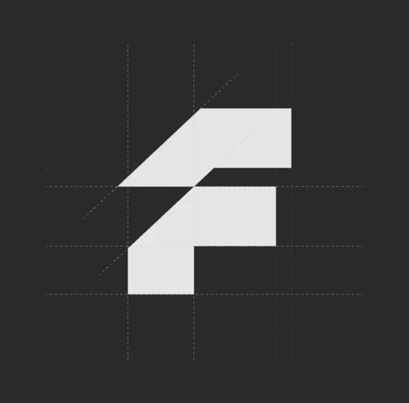
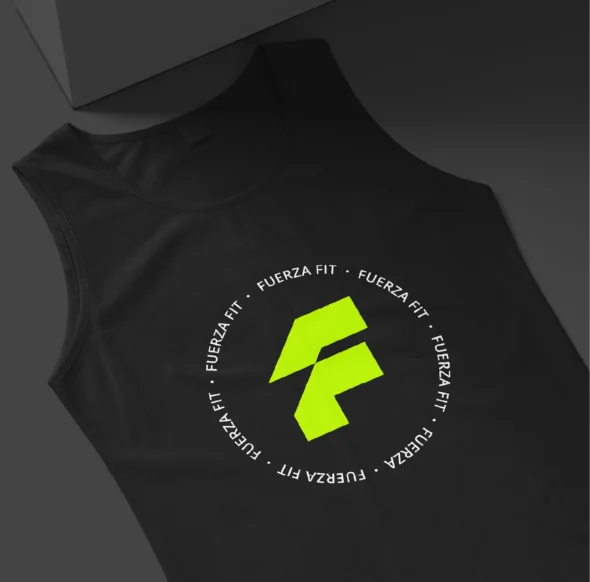
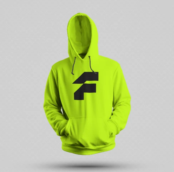
El nombre lo decía todo. Fuerza no necesitaba adornos ni desvíos. Su identidad debía reflejar esa misma determinación, esa energía que se siente justo antes de dar el primer paso. La tipografía es audaz e inquebrantable, los colores contrastan como el miedo frente a la decisión de actuar, y el logo es más que un símbolo: es una declaración.
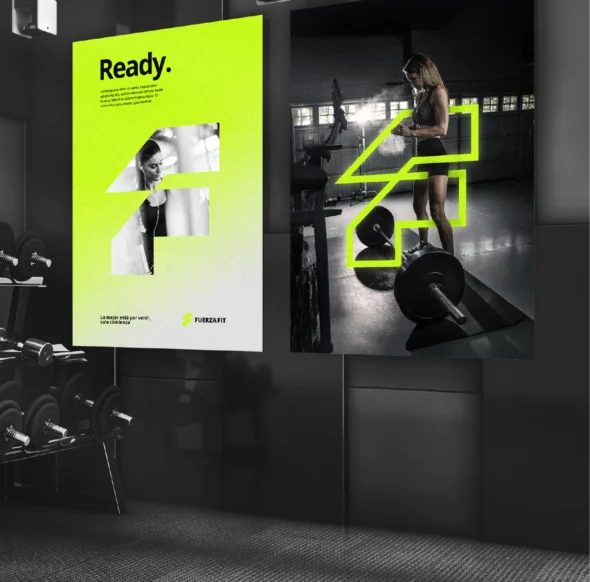
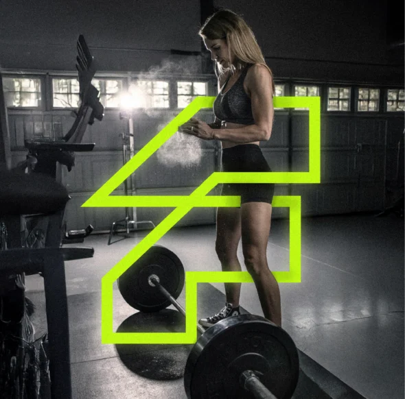
Más allá de una marca—un movimiento
No construimos una marca que venda membresías; construimos una que inspira movimiento. Fuerza no es un lugar, es el inicio del cambio. Es el punto de partida. Aquí es donde las dudas pierden fuerza, donde las excusas quedan atrás, donde todo comienza.