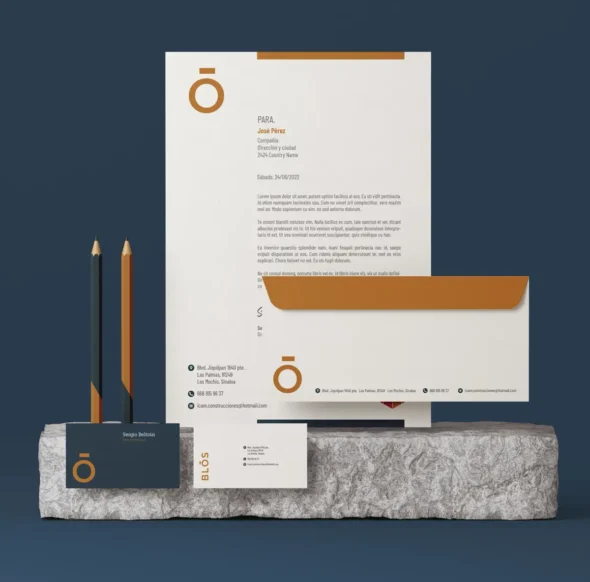
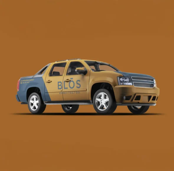
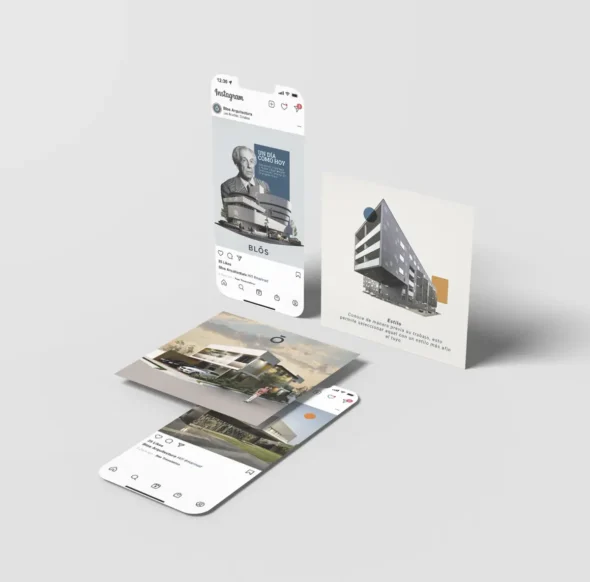
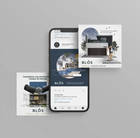
BLOS no es solo un despacho de arquitectura. Es un reflejo del cambio, de cómo la forma puede reinventarse. Desde el primer boceto supimos que la identidad de BLOS debía ser tan dinámica como el mundo que la rodea. Algo que pudiera adaptarse, algo que hablara el lenguaje universal de la nueva generación: formas, colores, simplicidad.
Simetría en la simplicidad
No buscamos complicar lo que puede ser claro. La nueva identidad de BLOS está diseñada para comunicar sin ruido, con líneas limpias y una paleta que refleja modernidad sin perder el toque humano. Sin adornos, solo lo esencial: lo que importa.
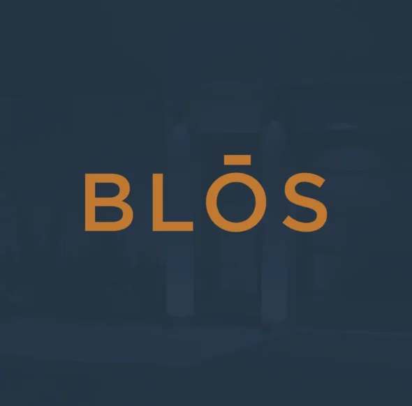
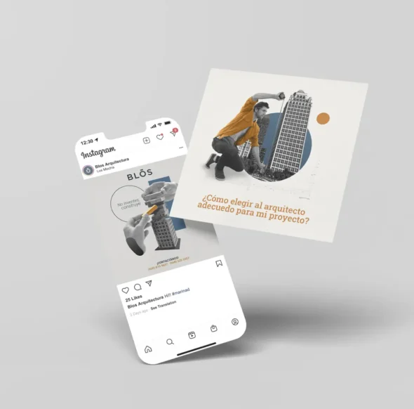
El logo: simple pero contundente
El logo es directo. No deja espacio para la confusión. Es claro, fuerte y fácil de recordar. Porque al final, eso es lo que importa: ser entendido a primera vista. No es solo un logo; es la marca hecha forma, construida para desafiar el futuro con una base sólida en el presente.