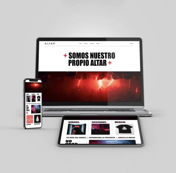
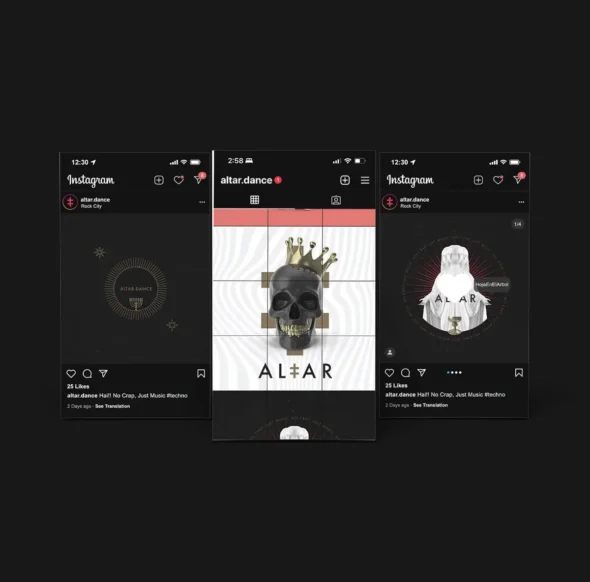

No se trataba solo de crear una marca. Se trataba de invocar una presencia. Una energía que vive en la noche, que se mueve con la música, que habla en códigos visuales a una comunidad que no sigue tendencias, sino sentimientos. Altar es una declaración silenciosa, una personalidad creada para integrarse con naturalidad en espacios digitales y físicos, pero lo suficientemente audaz para destacar en medio del ruido.
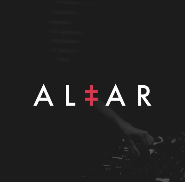
El símbolo detrás del nombre
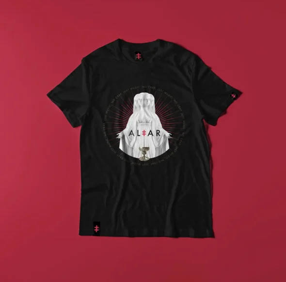
La “t” en el logotipo no es una coincidencia. Fue alterada deliberadamente: un gesto silencioso que lo dice todo. Un acento gráfico que rompe la simetría y sugiere dualidad: orden y caos, claridad y sombra, cuerpo y espíritu. Esa intervención tipográfica sutil marca el tono y le da pulso a la marca. No grita—pero exige presencia.
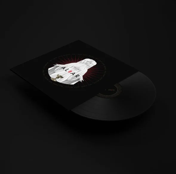
Estética al servicio del ritual
La identidad visual de Altar es clásica, casi contenida. Y esa contención no es falta de carácter, sino reverencia por el ritual. Porque cuando el piso tiembla y las luces bajan, basta una señal clara para saber que estás exactamente donde perteneces.
Altar no pretende ser algo que no es: es una marca para quienes ven la noche como un espacio sagrado.