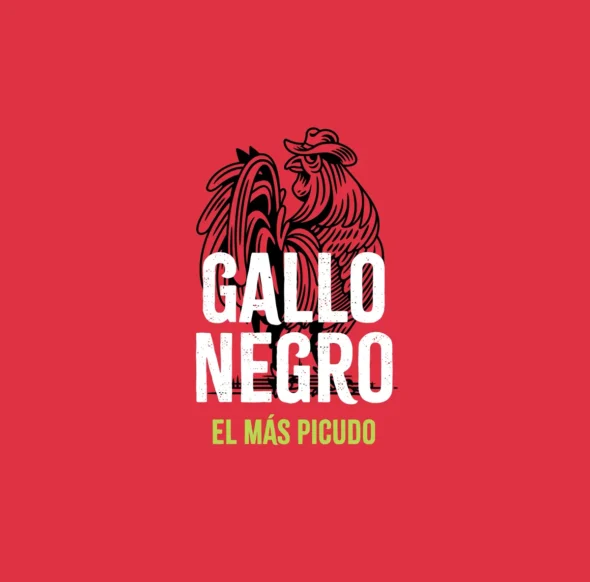


Cuando nacen las marcas, deben atreverse con su mensaje y su imagen. Palabras y colores que trabajen juntos de manera natural, complementándose entre sí. Así fue como creamos la esencia y el branding de Gallo Negro.
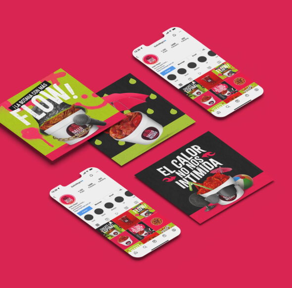
Desde el principio supimos que Gallo Negro debía destacar. Tenía que romper con lo convencional, ser audaz y resonar con una nueva generación. El diseño debía hablar por sí mismo: gráficos limpios, tipografía clara y colores vibrantes que irradiaran energía y vida. Un enfoque juvenil, pensado precisamente para conectar con su público objetivo.
El nuevo gallo en la ciudad
Gallo Negro no es solo una marca; es una declaración. Es el nuevo gallo que llegó a la ciudad: firme, bien plantado y distinto a todo lo demás. Su singularidad no está solo en su imagen, sino en su esencia. Una marca construida para ser única, memorable e inconfundible.
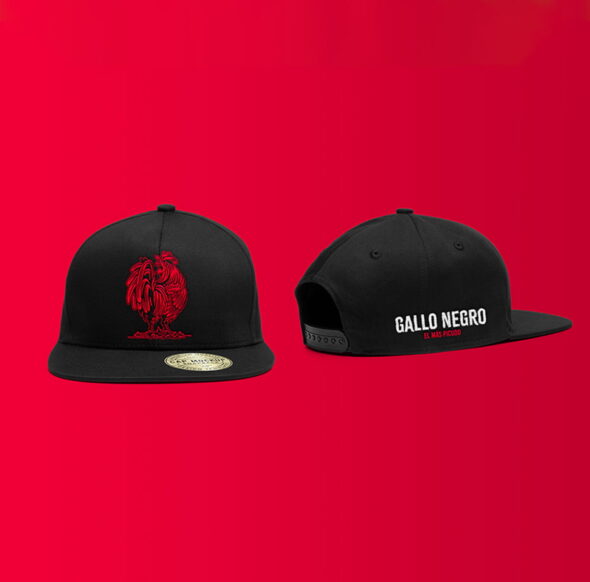
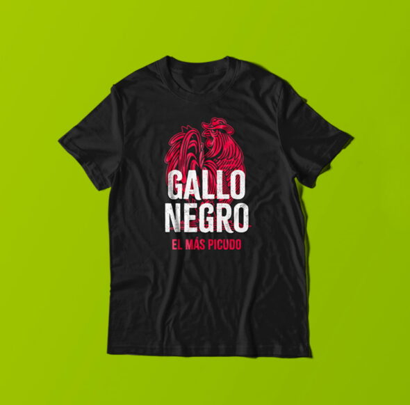
Desde el logo hasta los elementos visuales, cada detalle de Gallo Negro está diseñado para atraer miradas y dejar huella. Esta es una marca que sabe exactamente quién es, hacia dónde va y cómo lo logrará: con fuerza, orgullo y mucha vida. Gallo Negro es el gallo que está listo para destacar y dejar su marca.